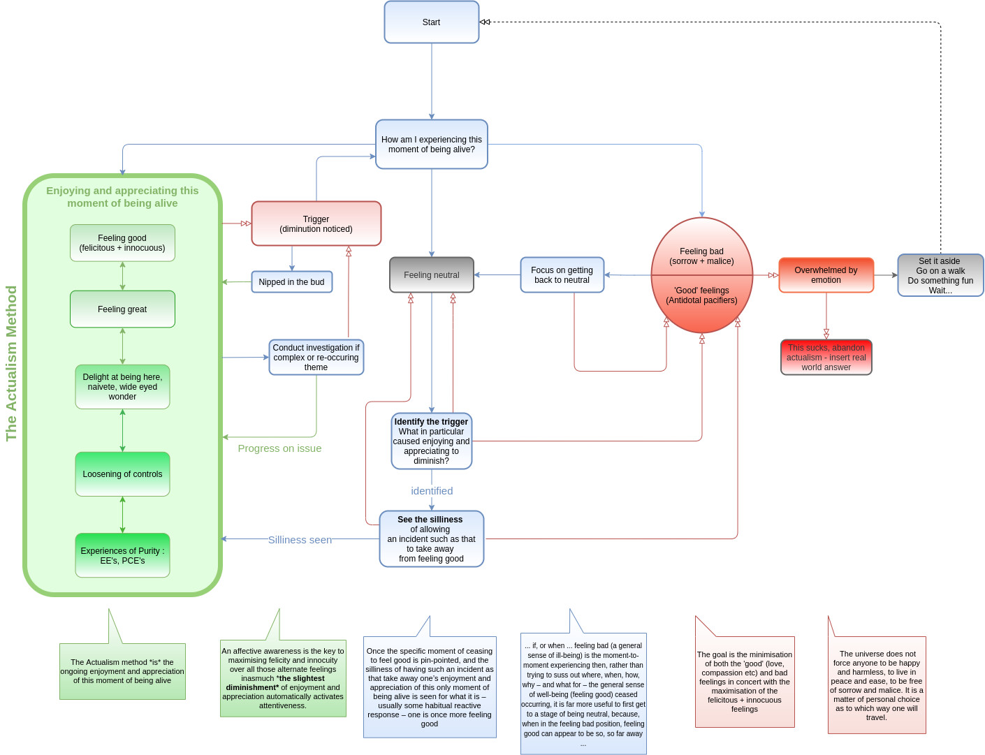
Yeah I will email it across now, I will send the colour version and the one just previous.
Actually I just realised that the already existing 3 text boxes (green, red and blue) explain the purpose of the coloured arrows.
As in the green box explains what the Actualism method is. The green arrows are all about the successful application of the method.
The blue box explains the process of seeing the silliness of feeling bad so that one is back to feeling good. The blue arrows demonstrate the successful application of the tools in order to get back to feeling good.
The red box describes that the goal is the minimisation of both the bad and good feelings and a maximisation of the felicitous feelings. The red arrows demonstrate a situation where one is trapped within a feeling pattern and takes steps to minimise or navigate out of it.
Ok! I took my crack at it – what does everyone think ??

If the reception is good then I can tidy it up, optimize the space etc…
A few things I like about it:
- ‘neutral’ is an answer to haietmoba as well
- the trigger comes from enjoy&appreciate as a whole instead of just feeling good
- after the trigger it goes back into haietmoba as you can be feeling neutral after trigger, not just feeling bad… so you first figure out where you landed. i initially did this just to optimize the lines on flowchart but i think it makes sense technique-wise too
- the enjoy&appreciate → trigger → nip in bud → enjoy and appreciate loop is very small
- it has you getting back to neutral before trying to identify & see silliness of the trigger
- there are many lines going back to feeling neutral/feeling bad while trying to id trigger or see the silliness… or even focus getting back to neutral… which matches my experience quite well when in the grip of these things
- i like the quote of “no one forces you to be happy” and if you want to really abandon actualism you can …
EDIT: Some downsides:
- there’s no “set it aside” from the neutral… like the ‘distract yourself to get back to feeling good’, if one is feeling neutral that might be a simpler way to get back to feeling good, than seeing the silliness…
I think the tricky part is that ‘seeing the silliness’ is different than ‘investigating the issue’. “Seeing the silliness” is just seeing that it’s silly to let that specific trigger take away from feeling good. Like “my partner said X and this triggered Y insecurity…” ok. Is it silly or sensible to let your partner saying X take away from feeling good? It’s just somebody saying this or that. You can see that it’s silly… but to untangle the Y insecurity can be a much deeper investigation and that would be something to do only after getting back to feeling good.
About the “universe does not force anyone to be happy” quote, it may come off as ‘mean’ or belittling - like if you’re overwhelmed then you’re doing something wrong. But my intention is more to convey that there’s no requirement to feel good, to take away that moral element of it…
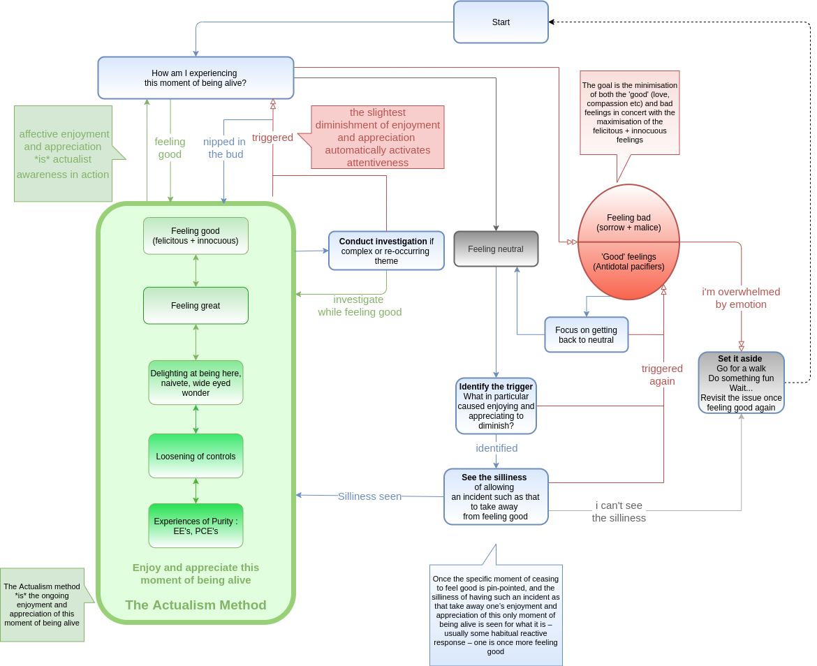
V2 of my crack at it:

It’s really very fun to go through this ![]()
I like the big green outline. It draws the eyes to the main game.
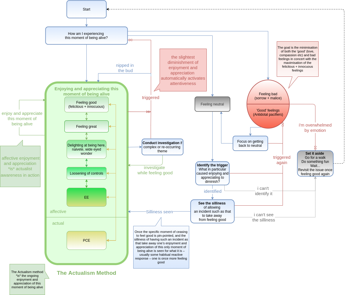
Can’t stop won’t stop the iterating ![]()

- Added actual vs affective enjoy & appreciation… and any box going to any other box to show that PCE can be spontaneous (you don’t have to run the full gamut)
- a ‘thing to do’ of ‘enjoy and appreciate’ coming out of the ‘enjoying and appreciating’ to make that feeling-good feedback loop clearer
- tidied up HAIETMOBA box a bit to make the things coming-out-of-it a bit clearer
- added “can’t id trigger” option too
I like this version best so far, but as Kuba said earlier the really relevant part is what people will find useful
What’s your favorite / most informative so far?
- #77 ( Actualism flow diagram - #77 by Kub933 )
- #84 ( Actualism flow diagram - #84 by claudiu )
- #85 ( Actualism flow diagram - #85 by claudiu )
- #87 ( Actualism flow diagram - #87 by claudiu )
- I like parts of each (select multiple)
0 voters
I like the last one the most so far. The green box is really good I think, especially with the addition of PCE being in a category of its own.
The main difference I can see so far with your diagrams vs my framework is that yours seem a lot more comprehensive in terms of almost walking one through of what to do at each step.
Benefit of that is a lot more direction/help along the way and an answer to almost any possibility. The potential drawback could be that with more and more options one could get overwhelmed when first applying it.
I have to say though it’s tricky for me to look at it properly as I have been so stuck in my head with the particular framework that I have been using. Now I need go come out of the box haha.
I’ve printed out one of the versions of the diagram and it’s actually really nice to have something physical like that to hand, now I can print hundreds and start sticking them to peoples windshield wipers ![]()
![]()
haha i know what i’ll do when i get home later – i’ll add another box from the ‘cant see silliness / cant identify trigger’ to “Discuss it with other actualists on http://discuss.actualism.online” ![]()
I like how there is no longer the alternative to give up and have some “real world” answers.
I am trapped into actually doing this like Alice in wonderland!!!
I actually liked the little grey option of leaving the diagram and going for real life answers. Not because I want to, but it serves as a good reminder that sometimes you try and get lost in it anyway. YMMV.
What if the “set it aside” box had a line like “Abandon actualism, try a real-world answer”?
EDIT: ah that won’t quite work cause it comes from not seeing the silliness too …
I’ll add the abandon actualism box back , seems cool ![]() but it will still have a dotted line back to “Start”
but it will still have a dotted line back to “Start” ![]() you do always come back to it don’t you?
you do always come back to it don’t you? ![]()
I felt personally victimized by that statement ![]() But quite accurate.
But quite accurate.
It took me time to notice and weigh the differences…
I voted for the last one, with the following amendment proposed (but I would also vote for the same option even if not changed). I would change:
because seem confusing to me as it is. I prefer the one from your previous version that went back to HIAETMOBA (giving two arrows, one in each direction).
On a side note, maybe the “Start” box became superfluous… If the HIAETMOBA box were placed in the middle-top, the diagram would be even cleaner and there would still be no doubt about where to begin
On a side-side note (ha,ha), I think ideally -and especially if “Start” is removed- all the arrows coming out from HIAETMOBA should do so from its bottom, while the ones coming in should do so from its right.
I like that this most recent one has descriptors on the arrows, I think that helps a lot elucidate ‘what is happening’ during the transitions between states
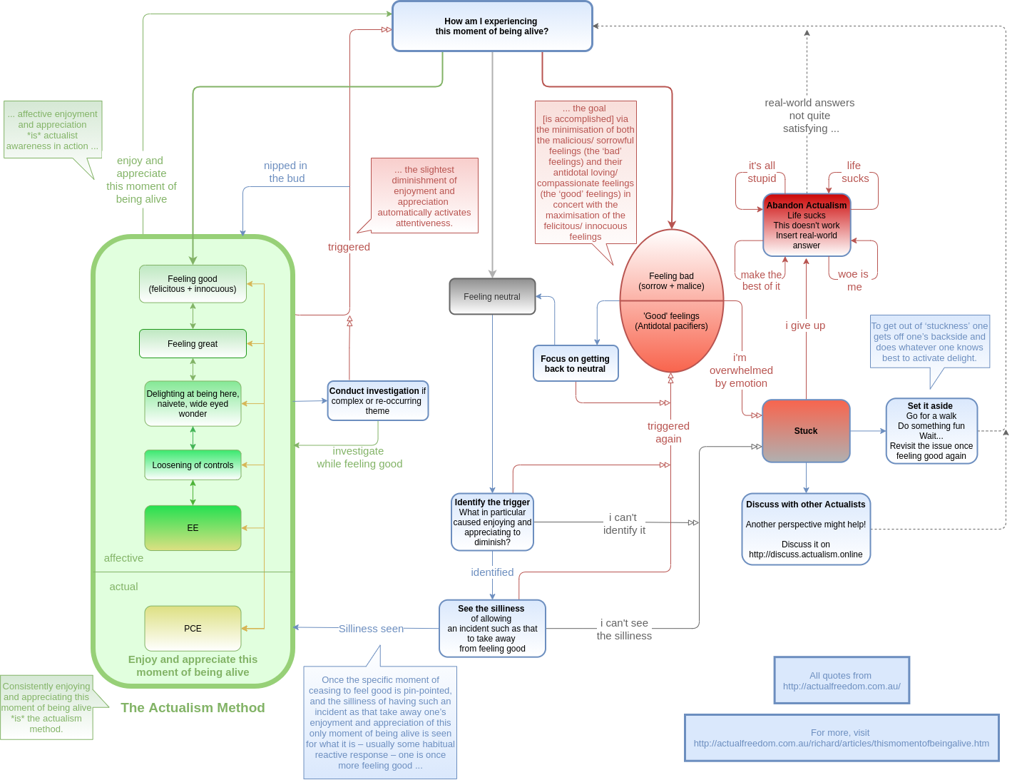
Ok! The very latest in actualism technology ![]()

-
@emp there is now the ‘abandon actualism’ option
 I hope the self-recursive arrows into and out of it have the intended humorous effect!
 - @Miguel I took your advices, having ‘enjoy and appreciate’ go back to HAIETMOBA. I also removed the ‘start’, and made all the exits come out of the bottom – and i made them a bit thicker too so it’s easier to follow them
- I added the ‘discuss with other actualists’ option
- In doing so I made ‘stuck’ a separate state, and put ‘set it aside’ as an Official Blue Technique ™, complete with a quote to support it
 .
. - and added some links back to the AFT site
- Also spent some time polishing and tidying it up
I am super excited about this diagram. Love the collaborative effort and all the constructive feedback. I see this as a condensation of many years of combined actualism experience ![]() . And although it is quite intricate, I think it ends up conveying the simplicity of the techniques… I also like that none of the options are ‘judgmental’ in any way. A truly actualist diagram lol!
. And although it is quite intricate, I think it ends up conveying the simplicity of the techniques… I also like that none of the options are ‘judgmental’ in any way. A truly actualist diagram lol!
Open to more feedback – it again seems like this is a good end (or close to end) point , but who knows … I’m thinking once it seems settled for a bit that I’ll see if Vineeto wants to post a link to it from the “This moment of being alive” page too.
Cheers all!
Yes, this one must run on diesel and be periodically oiled ![]()
Just kidding, of course. Great teamwork, great product.
It seems to be a good time to let it be until its use (especially by new practitioners, but also by the rest) suggests some improvement.
I just wanted to add, that I reckon if this ends up being an app, or some click through program, it has the potential for being a REALLY effective tool. The bluntness and clarity it would provide, could potentially end up in a lot of nipping things in the bud and lighthearted laughter at the silliness of feeling-bad triggers.
Awesome @claudiu this latest version seems to at the same time offer the comprehensive information whilst still being easy to follow ![]()