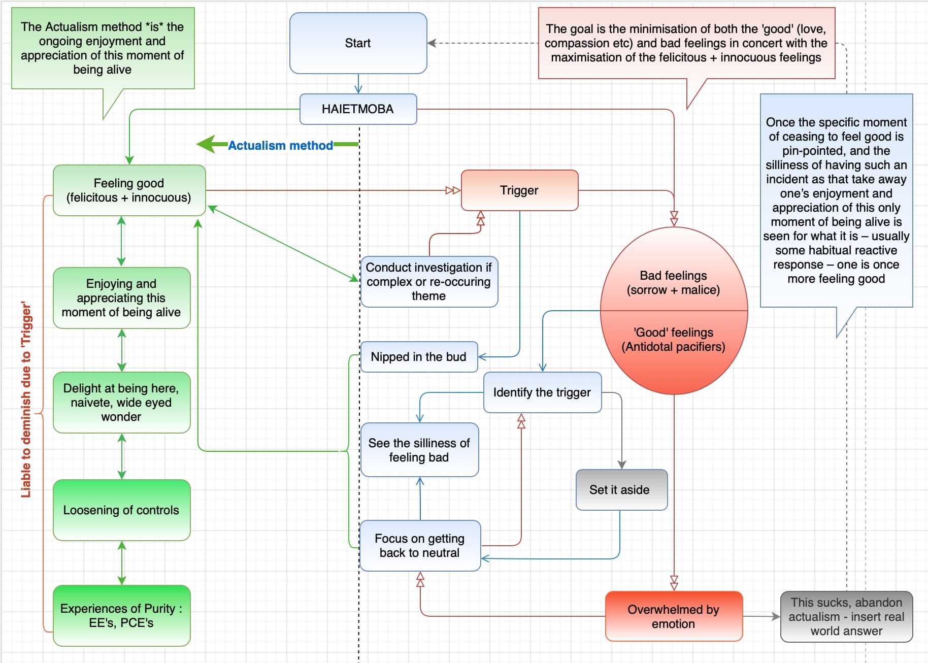
Ok so I am starting to go down a slightly different avenue with this, I thought instead of making it look more complex, to try to instead simplify by using visual aids.
So I have reshuffled the pathways in such a way that now one can miss the trigger → go into ‘overwhelmed’ → neutral and from there they now have a clear option to ‘identify the trigger’ and then proceed into ‘see the silliness’ and eventually ‘feeling good’.
The other main change I have done is categorising the arrows themselves to represent the typical pathways one may follow :
-
The green arrows represent the Plan A, (the ideal scenario) - they are the pathway where one continues feeling good and climbing up the felicitous ladder.
-
The blue arrows show the successful application of the tools in order to get back to feeling good - they are not the ideal scenario, after all one only applies the tools when one has wondered off the way, however they are still the ‘preferred’ option over the red arrows.
-
The red arrows show primarily the disruption to the application of the method by various feeling factors. One is best served to avoid following those paths however they will inevitably happened and one learns how to navigate out of them quickly and efficiently.
-
The grey arrows are more for things that aren’t really tools but more like a ‘break from trying’, until one is ready to feel good (green), apply the tools (blue) or face the gauntlet again
 (red)
(red)
This is just an idea for now but I think this could be useful in adding more specific options whilst still keeping simplicity.
All this after I said no more updates ![]()