Looks promising. I would love to clean up the visuals. I still have the logo/header thing I made for Zulip. Can I become mod or something? Also the themes have some weird color choices that makes text hard to read. Dark theme is broken. Anyways, just minor stuff that can be fixed.
made you an admin, have fun 
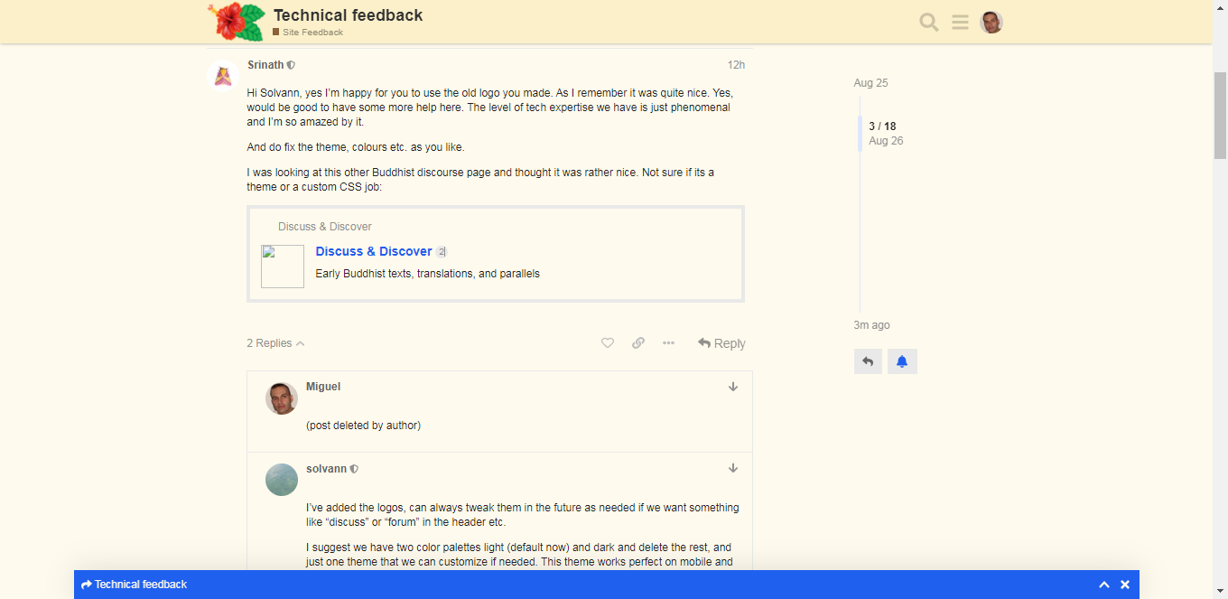
Hi Solvann, yes I’m happy for you to use the old logo you made. As I remember it was quite nice. Yes, would be good to have some more help here. The level of tech expertise we have is just phenomenal and I’m so amazed by it.
And do fix the theme, colours etc. as you like.
I was looking at this other Buddhist discourse page and thought it was rather nice. Not sure if its a theme or a custom CSS job:
Hi,. I have activated the live notifications
Let’s continue:
Seeing this previous message Welcome Actualings! - #10 by Miguel, it doesn’t show the preview image I’ve attached. Just an icon saying thatg the image can’t be loaded.
@claudiu and @Claudiu2 (what are u doing with two accounts? ha,ha!):
- Can you SEE/OPEN that image (still exists?), in spite of the icon (I can’t)
- Do you see the icon or see the preview instead?
ah the image link died cause I changed the domain name of the site 
Oh, it is all right, then. Good
Let me know if you need testing or feedback on the changes you make, @solvann
(I’ve deleted a previous post because I’'ve noticed I was asking @Srinath something non-technical: move the question to the Welcome topic)
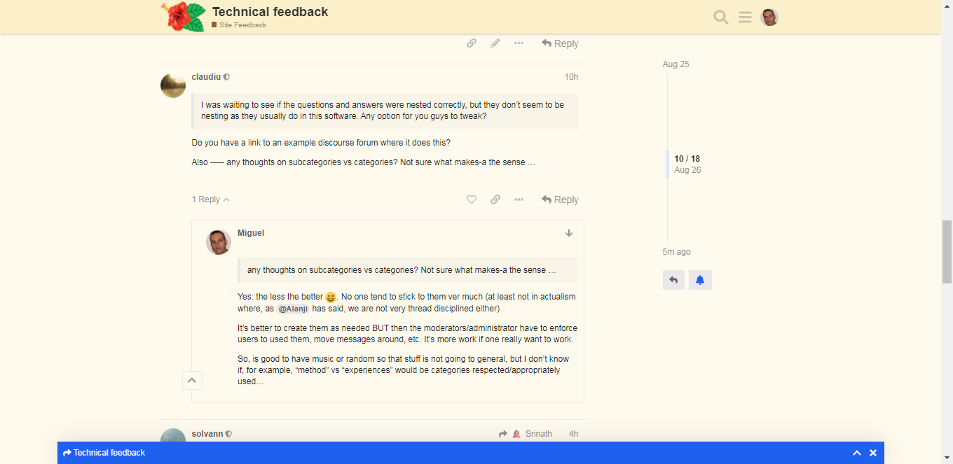
I was waiting to see if the questions and answers were nested correctly, but they don’t seem to be nesting as they usually do in this software. Any option for you guys to tweak?
I was waiting to see if the questions and answers were nested correctly, but they don’t seem to be nesting as they usually do in this software. Any option for you guys to tweak?
Do you have a link to an example discourse forum where it does this?
Also ----- any thoughts on subcategories vs categories? Not sure what makes-a the sense …
I’ve added the logos, can always tweak them in the future as needed if we want something like “discuss” or “forum” in the header etc.
I suggest we have two color palettes light (default now) and dark and delete the rest, and just one theme that we can customize if needed. This theme works perfect on mobile and we can use the “install webpage as app” thing, works perfect also.
Since this theme works good we use it as base and just tweak it slowly to get some branding without breaking anything 
@solvann nice work on the logo! I agree with your suggestion about themes
Looks good to me! The only tweak I had was logo size hack but looks like thats fixed (looks good on my mobile phone anyway)
Seems like the mobile version uses dark mode automatically if you have that enabled on you mobile which is nice
Agreed
Cool, I can see that you are typing @Miguel. I’m really liking this forum, very live feel to it.
any thoughts on subcategories vs categories? Not sure what makes-a the sense …
Yes: the less the better ![]() . No one tend to stick to them ver much (at least not in actualism where, as @Alanji has said, we are not very thread disciplined either)
. No one tend to stick to them ver much (at least not in actualism where, as @Alanji has said, we are not very thread disciplined either)
It’s better to create them as needed BUT then the moderators/administrator have to enforce users to used them, move messages around, etc. It’s more work if one really wants to make the categories work.
So, is good to have music or random so that stuff is not going to general, but I don’t know if, for example, “method” vs “experiences” would be categories respected/appropriately used…
Oh, but now the messages seem to have appeared nested as well… Look

And THIS thread:

So, I think I know what happened: it is possible that the software waits until there are enough messages to start nesting them per thread.
Oh, that’s what my tech savvy friend told me: not long ago, one of the characteristics that differentiated the forums from the chats was the INABILITY to see in the forums if someone was writing, to avoid what happened in the chats (especially political, etc.): someone waiting for that one to publish something to IMMEDIATELY “step on him” with his comment (which would obviously would go “on top of the attentional pile”).
Precisely the forums tried (and still try to some extent) to force more reflexive ways of communication and one way was that: NOT KNOWING if someone was writing. In older times, you couldn’t even know who was online).
However, my friend told me that THIS is one of the “hybrids” softs that had incorporated that and other chat functionality.
Not sure how that works but all the replies are visible at the bottom at least, and in latest post etc. So it’s never lost like in Slack.