Test text, super important
Good to see how it looks. It’s important to experiment
Did you notice how this topic shows up in the parent folder as well? That’s not quite what I expected. That makes it confusing.
Yes. It’s by design, I think so that users can see at a glance everything that happened within the category, but also easily differentiate the topics that belong to subcategories, thanks to the mixed colors (in this case the rectangle half yellow and half blue).
However, I’ve changed the Journal’s category filter here:
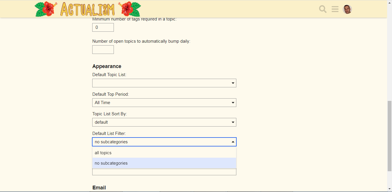
Do you prefer it that way?
Not sure we’re talking about the same thing. This is what it looks like to me:

I tried setting the amount of featured subcategory topics to 0 but there needs to be at least 1 featured topic.
I mean, this can’t be right. This has never been how sub categories work. I must have cached data or something…
May be we ar talking about the same, but I’m from my PC.
This is how the Jornal list looks with no filter:
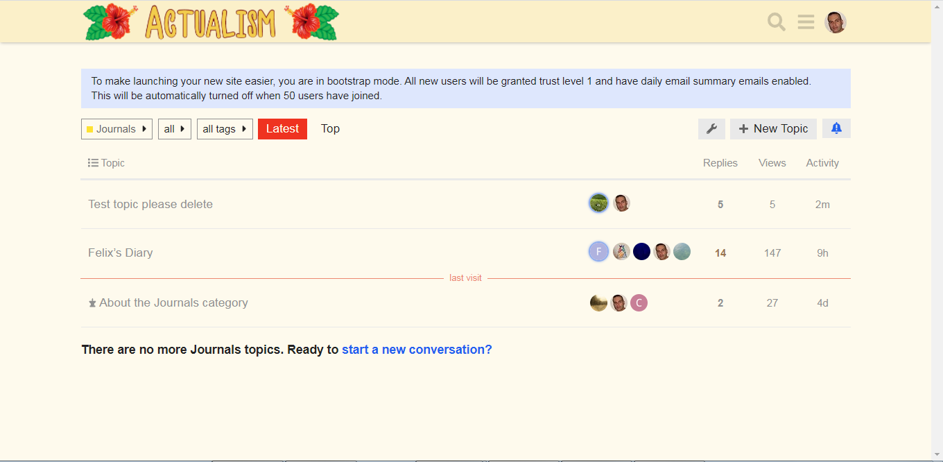
The topic is there
This with filtering subcategories topics:

No topic there
I have to admit that it makes it even more confusing. The view I had taken a screenshot of was from the top level, where the subcategory is visible, but topics from the subcategory are also visible as if they were topics in the top category. Then you enter the category, and all of a sudden the subcategory is no longer even visible.
A “normal” navigation pattern would be to treat the subcategory like sub folder in a file system. Contents are only visible when you’re “inside” the folder, the folder is visible in the parent folder and none of the sub folder contents is visible in the parent folder. I’m thinking this fits into Discourse’s view of how things should be (flat, easily visible etc) but it makes very little sense to me.
Yes, that could be the reason, but I’ve just seen the forum from the top level with my cellphone. Clearly displays differently than the top level from the pc:
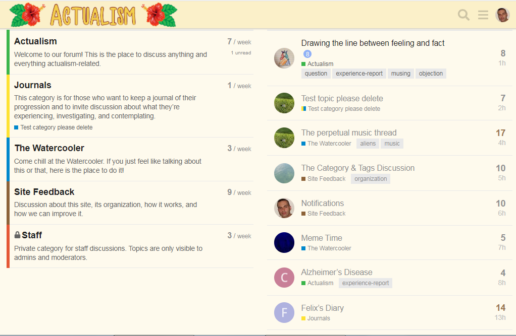
The site is configured to show in the main page “Categories” and “Latest post”. In the PC these are shown separately, in the right-hand column. Notice that “Test topic please delete” and “Felix’s Diary” are still among them.
In the cellphone view we also see these two, plus the “Test category please delete” subcategory.
So it is possible that what we see in the cell phone is a mixture that also contains the last topics. To check it out, we could wait for other topics to be added without continuing to write in this one (I hope to start my own diary soon, you will continue to write in “Feliz diary”, etc.).
But the PC view version seems to work correctly: the top view shows only categories (with the latest topics -regardless of the categories- in another column). When we enter the “Journal” category we only see its topics (now, with the new filter). We have to go into “Test category please delete” to see the topic “Test topic please delete”; otherwise it does not show in the parent category.
Also, the PC version shows correctly the topic “About the Journals category” both inside “Journal” and inside its subcategory “Test topic please delete” because it is pinned.
Yeah, I switched over to my iPad and saw the same view. I rarely use desktop though, most social stuff happens over the cellphone. It’s weird that they’ve chosen that kind of layout for a device type that a lot of people are bound to use as their only device.
After much kvetching I’ve realized that this is actually a really elegant solution, especially if we keep the default settings for sub-categories (so no masking). I’m fine with us going ahead with the sub-categories as suggested 
So, @staff, we could delete this topic and move “Journals” as a subcategory of “Actualism”.
What do you think?
Currently I am leaning towards @solvann 's idea here: The Category & Tags Discussion - #11 by solvann , i.e. have no sub-categories and no required tags.
If ‘journal’ becomes popular as a tag then it can become a sub-category…
But until then this prevents topic fragmentation.
Not a strong opinion… really I think with the volume and regulars we have here anything will work, and it’s a matter of waiting to see if/when the discussion group expands, what will make sense then…
But until then I’ve removed the requirement of having a tag from one of the pre-defined tags, but still requiring 1 tag.
I moved the topic in preparation of deleting the category. Also wanted to try the mod tools on a topic level