Actualism flow diagram

Wow, @geoffrey , you never stop amazing me. That was such a wonderful explanation, it propelled me forward with sincere intent and clarity …

For me as a new comer, your explanation, “cuts the bread in bite size pieces” for me, so as to help me avoid confusion, and also set realistic ( hopefully achievable ) goals for myself. The confusion always leads to frustration, inadequacy, and hopelessness ( which is opposite of AF method ). The AF writings and website, throws everything at you at the same time, so you think, you should aim for PCE at the very beginning ( maybe you should ?). But as you made it clear once again, sincere intent to consistently feeling good is the crucial and un-skippable first ( maybe long and formidable step) .

You are wonderful Geoffrey, I don’t have the words to thank you enough! :slight_smile:

p.s.
@ admins The above post by Geoffrey should be a required reading for all those not yet Actually Freed lol !

2 Likes

We need a “zoom in” option to be able to read the fine prints. thanks @claudiu

Ah just click on the image and it will expand it - and on the bottom it has a “Download” button, which you can then view the image in your image viewer of choice and zoom in :slight_smile:

image

1 Like

Yes, @FrankN. And if it’s still too small OR the right/left edges are out of sight and you can’t move the image around, at least in Chrome go back to the picture, right click on it, choose “Open link in a new tab” and you will be able to zoom more AND move it.

Ah just saw this — I actually put it green for a reason

I think of the colors roughly as:

  • red/gray/green - emotional/affective/intuitive states or happenings (if not choices) , or approaches
  • blue - cognitive choices / tools
  • yellow - purity / pure intent

So for example identifying the trigger is a cognitive thing , using memory to trace back etc.

While rememorating feeling good is an intuitive approach , not cognitive.

Note how from HAIETMOBA, the feeling-good option is green, and the path back from feeling good to HAIETMOBA itself is also green - to indicate these are emotional pathways.

Indeed maybe HAIETMOBA should be a gradient from green->gray->red itself , instead of blue …

1 Like

Dear @Kub933 and dear @claudiu, me and Leila have been studying your Diagram, and even verbalized it to post on her Tg Channel, to the best of our ability into Farsi and it has been very fruitful in helping us as well, it is much appreciated it!

I thought about a couple of “pointers” that might be catchy and impactful, to be added to the Diagram :slight_smile:

1.) Some where in the “Green Box”— mention that “I am no longer needed or necessary” . Seeing this will act as a “wow” and a beacon( also setting in site the eventual goal of AF, i.e. self immolation ) for new comers like me. And as a reminder for the more advanced people.

2.) The other point that may not be as easy to place in the Green Box, is the subtleties of Naivete and Pure Intent ( which I myself just learned about from @geoffrey response to my “Third kind of Feeling” inquiry. You may want to indicate that the Diagram is a 2 dimensional representation of Actualism Method, which is “multidirectional”, especially when you get to the more advanced stages of Purity and Perfection.

Thank you all again for this wonderful new tool!

2 Likes

Thanks for the feedback! I’m glad you are finding it helpful :slight_smile:

At first I thought it would be ‘too much’ to include your pointers, but then I ended up making this:

actualism-v11-v5-draft1.drawio (4)

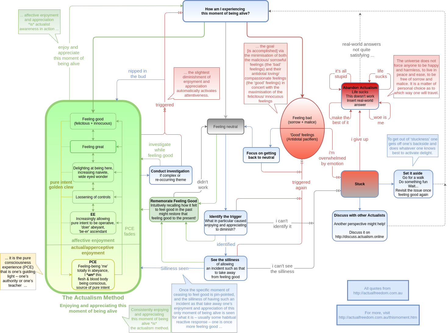
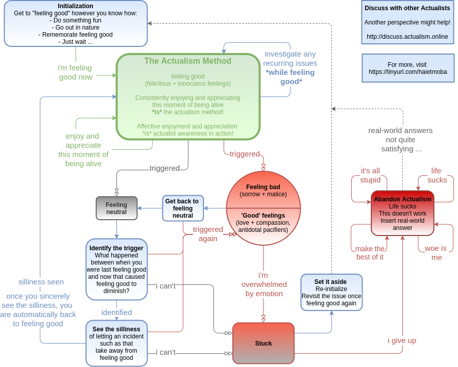
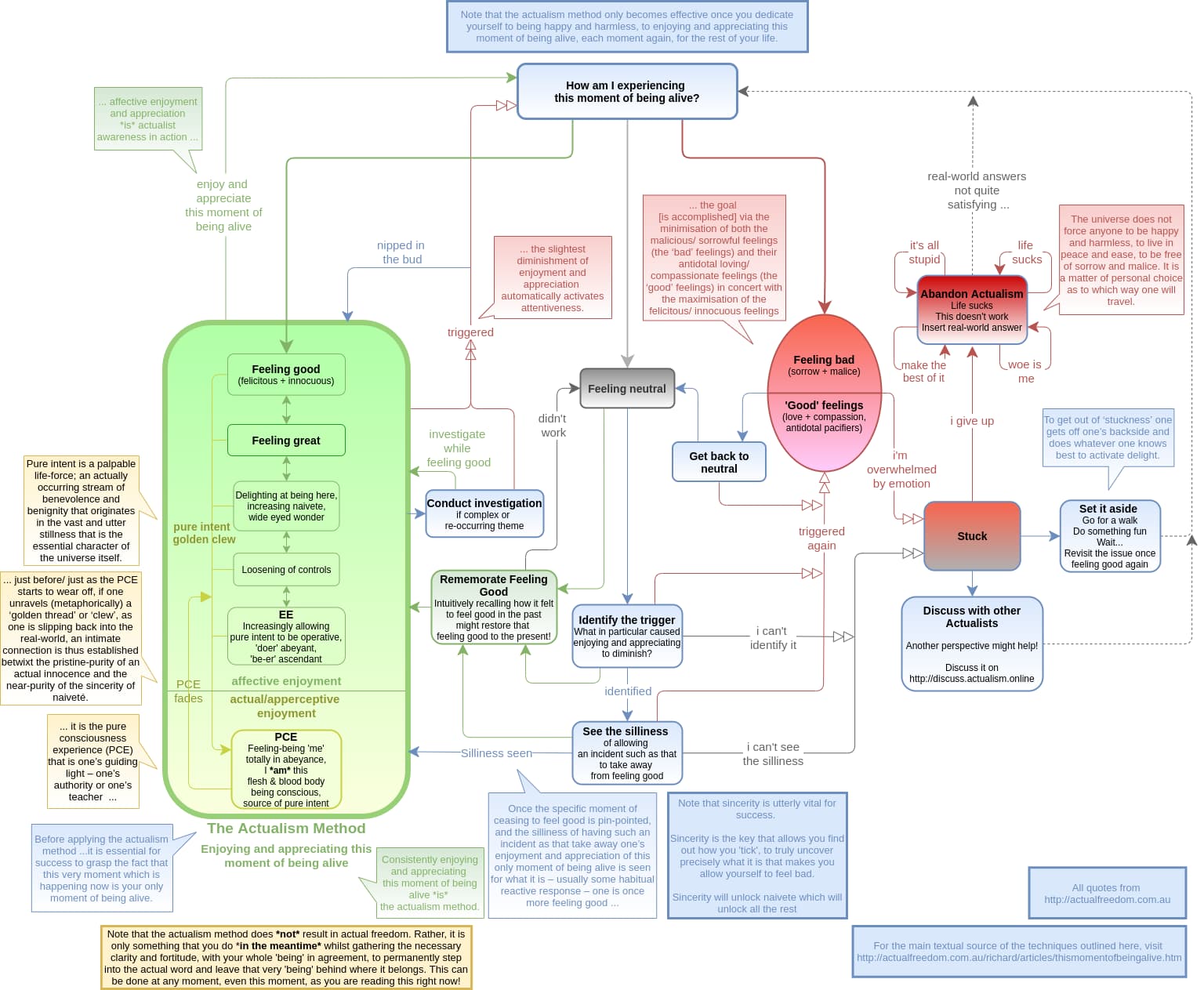
The main changes are:

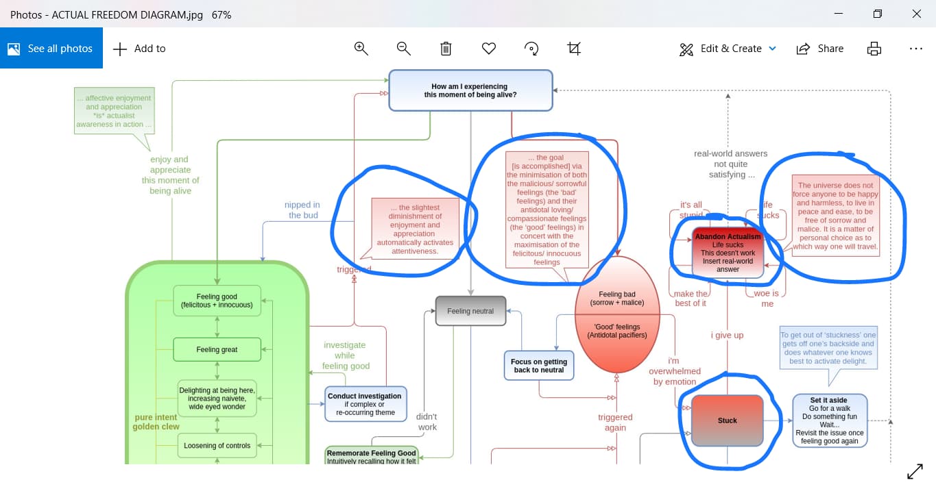
  • i explicitly labeled the ‘pure intent / golden clew’ arrows, which pull one towards a PCE
  • added descriptions on EE and PCE that indicate that ‘I’ first let go of the controls and then totally go into abeyance
  • some cosmetic improvements :smiley:

My main goal, prompted by your feedback, was to make it clearer the importance of the PCE, how it is one’s lodestone / guiding light, how pure intent plays a role. To direct the budding actualist towards that.

About the role of naivete, I wasn’t sure how to add this – I changed the third box from “Delighting at being here, naivete, wide eyed wonder” to “Delighting at being here, increasing naivete, wide eyed wonder” … but that is the only mention of naivete in the diagram.

However, I don’t think it is possible - or desirable - to have the one diagram explain every aspect of actualism. There is much that is not here – the role of intimacy, for example, and how the ‘good’ feelings ultimately spoil it. How sincerity is ultimately the key. The importance of undoing the social identity. The moving away from using ‘right’ and ‘wrong’ morality and/or feelings to determine what to do as opposed to what is silly and sensible. How it is vital to see that this moment is the only moment of being alive, the only moment that is ever actual - and that it is always this moment. etc etc etc.

There’s no way it could all fit. Actualism is exceedingly simple but the ramifications of it are as far-reaching as the ending of the human condition itself, which is fairly (though not infinitely) vast in its intricacy and traps etc.

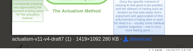
Rather this diagram is mostly to highlight how the basic tools and techniques work in practice, that can get one to successfully applying the actualism method – i.e. consistently enjoying and appreciating this moment of being alive via a very basic (yet sufficient in and of itself) feeling good.

And there is a link to the AFT site as well as this forum for those who see the diagram and have more questions :smiley: .

I think the role of an active actualist community is not to be downplayed. I see it as a valuable resource, a sort of “catch-all” where if anybody interested in actualism has a question, if they are simply aware or redirected to this forum then they can ask it and further their actualism inquiries as far as their heart desires. There is a lot to be said for having static reference material that provides all the necessary information (as does the AFT site) – to the point of it being almost necessary to make available – but being that the AFT site provides that already, and now we have this community, we can take advantage of it :smiley: .

4 Likes

Good.

The position of “PCE fades” confused me: I did not understand what it was doing before the PCE itself and why it was next to the EE box, until I saw it attached to the returning arrow/s from the PCE and until I assumed it is not specifically labeling EE.

So, if I were to put it, I would put it “on the fence”, on the line that separates the two states. And maybe add a similar label on the left, also on the line, saying something like “PCE increases”?

On a cosmetic level, could all arrowheads be somewhat enlarged?

1 Like

This is where the interactive “3D matrix” would be great! :stuck_out_tongue_winking_eye:

There is a very simple, extremely minimal, first level diagram. Much like Kuba’s first one.

Then one clicks on a section, and it expands to another level with more details… And so on. The next level may be kinks to articles.

Or even links to discussions on the forum.

I think it is losing something of the initial appeal as a simple visual diagram, however the ongoing discussion about it is great! I am being continually reminded to feel good and it’s enjoyable to see us having fun with this together!! :hugs::+1:

3 Likes

Yea I was just thinking to re-make a ‘simplified’ version lol

Interactive may be the way to go… and then there can be links to the quotes and terms as well, click to go to relevant part of AFT site …

Or do both!! More actualism resources lol :smiley:

3 Likes

Ok! I’ve been busy …

simple-actualism-v1.drawio (12)

I basically re-did it thinking to make a simplified version, but then I think I ended up with simply a better version?

What do you all think:

  • The more detailed one is the way to go, +/- some tweaks
  • The simpler one is the way to go, +/- some tweaks
  • Keep both!
  • Something else (make a post!)

0 voters

What came to mind with this one is that it always makes more sense / is easier to explain from the starting point of feeling good. So I organized it that way – do whatever you can to feel good, and then… you can employ the method.

I left out the quotes to reduce the clutter, which worked well. But it is less descriptive/detailed of course …

1 Like

I like that one alot!

Visually, it has the method at the top centre.

It flows better.

But, yeah. Keep them all!

I have found looking at them and the discussion like a “seminar / workshop”, and the different versions and refinements are drilling it into my visual memory. :+1:

Heya, do you have or know any resources or writings on this? On cultivating / allowing / discovering naïveté etc

I like the “older” version, because it clearly separates and “demarcates” the Actual World from the Real World ( left and right ), and by being shown Vertically, it also drives home and symbolizes the “down pouring” exponential(like a waterfall), effect ( progressive success ) of applying the Actual Freedom method over and over again.

Besides that the only suggestion that I would have is change the color of the 5 prominent reddish squares ( I drew blue circle around them) , to a more “neutral” color, as these Red colors looks very intimidating and scary ( especially when zoomed out ) to the “uninitiated”.

Again, thanks @claudiu . BTW, you last reply to my previous suggestions, was so comprehensive and eye opening, that I felt like, I had “the Book thrown” at me ( it was like I was “schooled” in how to apply the method for an unbelievable refresher course). /////////// And as I have said before, you “actual people” never stop to amaze with your clarity and over extending generosity ( and the joy of what you are doing, living this life, shines through your expressions on these seemingly simple pages of discuss.actualism! Salute :slight_smile:

Image

p.s. I think that what you wrote to me in your reply ( I just read it again, and enjoyed it again), should also be definitely added( as after you mentioned it, I remembered that Richard stressed this point very early on) "How it is vital to see that this moment is the only moment of being alive, the only moment that is ever actual - and that it is always this moment. And also Sincere Intent, because that is the big “macarow” , the “Grand Daddy”, the ever needed “jump starter”( and it includes the Prima Facia also) if you will.

3 Likes

I think having 2 versions might be the way to go. The other day I scrolled all the way up to the very first versions of the diagram and as much as there was a lot of info still missing, there was also a simplicity to them that to an extent has been lost now.

The more advanced versions of the diagram are great for someone who wants more specific answers/scenarios addressed so it should stay.

But I think at the same time if this is included in the resources we should also include a very much simplified version of the diagram.

This way there is a more digestible version that can be used to gain a general idea of what to do and will be very easy to run through.
Then also the more advanced version which might address some specific questions one may have.

:joy: and as I write the post @claudiu does just that!

I’ve incorporated @Miguel and some of @FrankN 's suggestions here:

actualism-v11-v6-draft1.drawio (1)

Also added a few more quotes related to pure intent!

I reached out to Vineeto and she said she’d be happy to link to the diagram. I made a resource page and will ask her to link to that, where a post is edited to have the latest version of the diagram, so as the charts get updated she won’t have to update the link each time.

Her suggestions were to add the notes at the beginning and the end, which I’ve incorporated as well.

About the red colors, I am torn – on the one hand I like the call-outs having the same color as the relevant topic. On the other I see what you mean about it being ‘scary’. But on the third hand, the point isn’t to be afraid of ‘good’ or ‘bad’ feelings – but rather to embrace the fact that we experience them, to not try to suppress it, etc. To which end, it might end up working out and be helpful, as the text in the red parts is not ‘scary’ but rather helpful :smiley: .

Keep the suggestions coming in! I don’t appear to be near the end point of being willing to keep improving them :smiley: .

1 Like

Awesome! I think maybe change the name of my diagram to something like - Bare-bones flowchart, I think its probably the most simplified version other than @henryyyyyyyyyy’s more visual depictions.

Test post

Can people unpin the diagrams topic? I want it to be pinned for new members but don’t necessarily want it forever on top for all time. I thought when it is read it unpins automatically but it isn’t for me …

EDIT: ah found it :slight_smile:

image

Very good Claudiu. In the very Top Blue Box, after the words
"you dedicate yourself"- you might want to add in ( Sincere Intent )
:slight_smile: